Did you know the right home decor color schemes can really change how your home feels? The colors on your walls can make your home feel cozy or lively. It’s all about the colors you choose for your walls.
Finding the perfect paint colors can seem hard, but it’s actually fun. This guide will help you pick the best paint colors for your home interior. We’ll cover color theory and how to create a color palette.
Key Takeaways
- Learn the basics of color theory to make smart choices.
- Figure out the best color palette for your space.
- Make a color palette that shows off your style.
- Think about lighting and furniture when picking colors.
- Use our guide to match colors all over your home.
Understanding Color Theory
Color theory is key when picking paint colors for your home. It helps you mix colors in a way that looks good together. It also shows how colors interact.
The color wheel is at the heart of color theory. It’s a circular diagram that shows color relationships. It’s a basic tool for understanding color combinations.
The Color Wheel and Its Uses
The color wheel has primary colors (red, blue, yellow), secondary colors (orange, green, purple), and tertiary colors. Tertiary colors are made by mixing primary and secondary colors. Knowing the color wheel helps you find colors that work well together.
Warm vs. Cool Colors
Colors are divided into warm and cool. Warm colors like red, orange, yellow make us feel energized. They’re linked with warmth and energy. Cool colors, such as blue, green, purple, calm us down. They bring a sense of peace.
| Color Type | Colors | Effects |
|---|---|---|
| Warm Colors | Red, Orange, Yellow | Energizing, Stimulating |
| Cool Colors | Blue, Green, Purple | Calming, Soothing |
Understanding Color Harmony
Color harmony is about how colors look together. There are different ways to mix colors, like complementary, analogous, and triadic schemes. Knowing these can make your home look better.
A complementary color scheme pairs colors that are opposite each other, like blue and orange. This makes for a striking look. An analogous color scheme uses colors next to each other, like blue, green, and yellow-green. This creates a calm and harmonious feel.
Assessing Your Space
Choosing the right paint colors starts with knowing your space. Look at the lighting, size, and décor. This helps make your home look better and feel right.
Evaluating Room Lighting
Lighting affects how paint colors look on walls. Think about both natural and artificial light in your room.
- See how natural light changes your room during the day.
- Think about your artificial lighting’s type and where it is.
- How light will change your paint color choice.
Considering Room Size and Shape
The size and shape of your room matter for paint colors. Big rooms can handle more colors. Small rooms look better with lighter shades.
Room Size Considerations:
| Room Size | Recommended Paint Colors |
|---|---|
| Small | Lighter shades (e.g., soft whites, pale pastels) |
| Medium | Versatile options (e.g., earth tones, gentle brights) |
| Large | Darker or bolder colors (e.g., rich jewel tones, deep grays) |
Analyzing Existing Furniture and Décor
Look at your furniture and décor for paint color ideas. Think about the colors and styles in your room.
- Find the main colors in your furniture and décor.
- Think about how to match or contrast these colors with your paint.
- Make sure your paint color fits with your furniture’s style and era.
By looking at your room’s lighting, size, and furniture, you can pick the best paint colors.
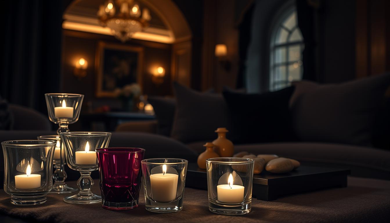
Setting a Mood with Colors
Colors can change how we feel and the feel of our homes. When picking paint colors, think about the mood you want in each room.
Colors That Energize vs. Relax
Colors can either make us feel energized or calm. Warm colors like orange, red, and yellow energize spaces. They’re great for busy areas like gyms or kitchens.
Cool colors like blue, green, and purple calm us down. They’re perfect for bedrooms or rooms for meditation.
For example, a bright red can make us hungry and talkative. It’s a good choice for dining rooms. Soft blue, on the other hand, helps us relax and feel calm. It’s good for bathrooms or bedrooms.
Choosing Colors for Different Activities
The activities in a room should guide our color choice. A home office might need colors that help us focus, like green or blue. A playroom could have vibrant colors to spark creativity and fun.
Here are some tips for picking paint colors based on activities:
- For areas that need focus, like home offices, choose calming yet energizing colors.
- For relaxing spaces, like bedrooms, pick soothing colors.
- For high-energy areas, like gyms or playrooms, go for vibrant colors.
Using Colors to Create Ambiance
Creating the right ambiance with color is more than just picking a favorite color. It’s about how colors work together with the room’s lighting and furniture.
| Room Type | Recommended Colors | Desired Ambiance |
|---|---|---|
| Bedroom | Soft blues, pale greens | Relaxing, calming |
| Home Gym | Bright oranges, yellows | Energizing, motivating |
| Living Room | Warm neutrals, earth tones | Cozy, inviting |
By choosing paint colors based on mood and activities, we can make spaces that look good and feel good.
Exploring Color Trends
Exploring interior design means looking at the latest color trends. These trends can change how we pick paint colors. Knowing them helps us choose styles that are both trendy and timeless.
Current Color Trends in Interior Design
Neutral colors like beige and gray are popular interior paint colors. They create a calm atmosphere in homes. Bold colors like blue and green are also popular, adding a fresh look. These home painting color ideas can make a room stand out or add a splash of color.

Choosing paint colors is all about trends versus timeless choices. Timeless colors are classic and simple. They’re safe for those who don’t want their colors to go out of style.
Timeless Colors vs. Trendy Options
Timeless colors are neutral and versatile. They fit well with changing design trends. Trendy colors are bold and exciting but might need more updates to stay current.
| Color Type | Characteristics | Examples |
|---|---|---|
| Timeless Colors | Neutral, versatile, classic | White, beige, gray |
| Trendy Options | Bold, exciting, contemporary | Blue, green, yellow |
Influences on Color Choices: Culture and Nature
Culture and nature also shape our color choices. Some colors have cultural meanings or are inspired by nature. Knowing these influences helps us pick paint colors wisely.
By looking at current trends, timeless colors, and cultural and natural influences, we can choose paint colors that reflect our style. This ensures our homes are beautiful and personal.
Creating a Color Palette
To get a cohesive look, it’s key to create a thoughtful color palette. A well-thought-out color palette makes your home look better. It creates a harmonious atmosphere that connects different rooms and spaces.
Choosing a Base Color
The first step is picking a base color that will be the main focus. This color should match your taste and your home’s style. Think about the mood you want: calm, energetic, or sophisticated.
Adding Accent Colors
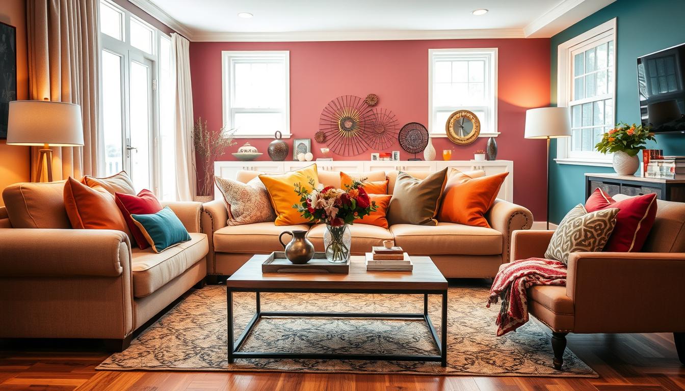
After choosing your base color, add accent colors for interest. Use these colors sparingly to highlight certain areas or features. They can be in furniture, decor, or accessories.
Remember the 60-30-10 rule: 60% of the room should be the base color, 30% a secondary color, and 10% an accent color. This keeps the room balanced and harmonious.
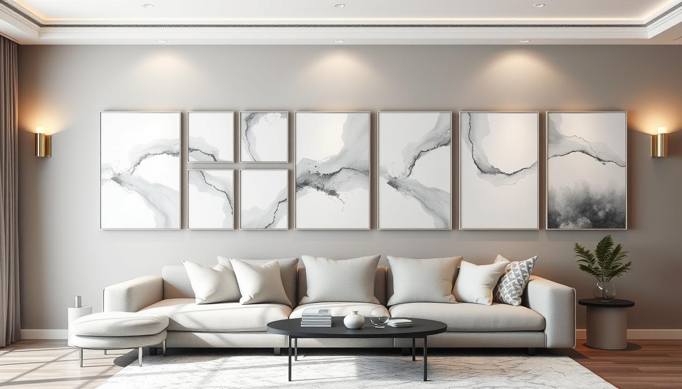
Using Neutrals Effectively
Neutrals like beige, gray, and white are great for balancing bold colors. They create a calm background for accent colors to pop. Neutrals also help tie different rooms together.
By mixing a base color, accent colors, and neutrals, you create a cohesive color palette. This palette guides your paint choices, ensuring a harmonious and beautiful result.
Testing Paint Colors
To pick the perfect paint color, testing is key. It saves time, money, and avoids frustration. Testing paint colors before you decide is essential.
Sampling Before Committing
Begin by sampling paint on a small wall area. This lets you see how it looks in your lighting. Choose a spot that matches the room’s lighting and colors.

Comparing Colors in Different Lights
Check the colors under different lights. Natural, artificial, and day time can change how colors look. Watch the color at various times for a full view.
Using Paint Swatches Effectively
Paint swatches help you understand the color better. They can be tested against different backgrounds and lights. Make a swatch board to compare colors easily.
Remember, think about the colors of furniture and decor too. This approach helps you choose wisely.
Understanding Finishes and Textures
Paint finishes greatly change how colors look in a room. It’s key to pick the right one. The finish you choose impacts the paint’s durability and how we see the color.
Types of Paint Finishes Explained
There are many paint finishes, each with its own traits and uses. Here are some common ones:
- Flat (Matte) Finish: Great for areas that don’t get much use and ceilings. It doesn’t reflect light and hides flaws well.
- Eggshell Finish: Has a bit of sheen. It’s more durable than flat and works well in living rooms and bedrooms.
- Satin Finish: Gives a soft shine and is very durable. It’s best for busy spots like hallways and kitchens.
- Semi-Gloss Finish: Very shiny and durable. It’s perfect for trim, doors, and windows, and places that need a lot of cleaning.
For more info on picking the right paint finish, check out Benjamin Moore’s guide on selecting paint.
How Finish Affects Color Perception
The paint finish can really change how we see colors. For example, flat finish makes colors seem less bright. On the other hand, semi-gloss makes them pop more. This is because different finishes reflect light differently.
Choosing the Right Finish for Each Room
Think about the room’s purpose and how much wear it gets when picking a paint finish. For example:
| Room | Recommended Finish |
|---|---|
| Living Room | Satin or Eggshell |
| Kitchen | Semi-Gloss or Satin |
| Bedroom | Eggshell or Flat |
Knowing about paint finishes and how they affect color can help you choose the best shades for your home.
Considering Flow Between Rooms
A well-coordinated home decor color scheme can make your home feel more connected. When picking paint colors, think about how they’ll work together. This creates a smooth flow from room to room.
Creating a Cohesive Look
To get a cohesive look, pick a core color palette for your home. It’s not about every room being the same color. Instead, find colors that complement each other and use them in different rooms.
- Select a dominant color for the main areas.
- Use complementary colors for accent walls or furniture.
- Consider the 60-30-10 rule: 60% dominant color, 30% secondary color, and 10% accent color.
Choosing Colors that Transition Smoothly
When picking colors for rooms next to each other, think about how they’ll blend. Use colors next to each other on the color wheel or different shades of the same color. For example, a blue living room can flow well into a blue-green dining room.
Using Color Blocks for Separation
It’s okay to use color blocks to separate areas in your home. Use a distinct color for the kitchen, like a different shade from the living room. This creates a clear separation while keeping the overall look harmonious.
By carefully choosing color coordination for home interiors, we can make our homes feel connected and stylish.
Eco-Friendly Paint Options
More homeowners are choosing eco-friendly paint options. These paints are better for our health and the planet. As we learn more about our impact, we seek sustainable home decor.
Benefits of Low-VOC and No-VOC Paints
Low-VOC and No-VOC paints reduce harmful air pollution. Low-VOC paints have fewer harmful chemicals than regular paints. No-VOC paints have almost none. This makes them great for indoor painting, improving air quality.
Recommended Eco-Friendly Brands
Many paint brands now offer eco-friendly options. Some top brands include:
- Benjamin Moore’s Natura line
- Sherwin-Williams’ ProMar 200 line
- Behr’s Premium Plus ULTRA line
These brands focus on quality and being green. They ensure their paints look and feel great.
How to Find Sustainable Color Options
Finding the right eco-friendly paint color can be tough. Here are some tips:
- Get advice from a pro painter or interior designer.
- Use online color tools from eco-friendly brands.
- Check out stores that focus on green home decor.
| Brand | Product Line | VOC Level |
|---|---|---|
| Benjamin Moore | Natura | No-VOC |
| Sherwin-Williams | ProMar 200 | Low-VOC |
| Behr | Premium Plus ULTRA | Low-VOC |
Choosing eco-friendly paints helps our environment and our health. As we look for popular interior paint colors and home painting color ideas, let’s remember to choose sustainable options.
Seeking Inspiration
Finding inspiration is key when picking the perfect paint colors for your home. Inspiration can come from many places, helping us choose the right colors for our walls.
Using Online Resources and Apps
The internet has made finding inspiration easy. Sites like Pinterest and Houzz have lots of images and ideas. We can sort them by style, room, and color.
We can also use apps from paint companies. These tools let us see how colors look on our walls. This helps us make better choices.
Visiting Design Showrooms
Seeing colors in person is unbeatable. Design showrooms and model homes show how paint colors work in real life. We can see how colors, lighting, and furniture go together.
When we visit, we should notice the color combinations we like. Then, we can think about how to use them in our own homes.
Creating a Vision Board
A vision board is a collection of images and colors that show what we want our space to look like. It helps us see how our color choices fit with our style. It’s a fun way to try out different looks.
To make a vision board, gather images from everywhere. Arrange them in a way that looks good together. Don’t forget to include paint swatches and fabric samples for a more accurate view.
By exploring different sources for inspiration, we can choose paint colors with confidence. This way, our home will reflect our style and feel welcoming.
Hiring a Professional
Choosing the right paint colors for your home can be tough. If you’re having trouble picking colors or need help, think about hiring an interior designer or color consultant. They can offer expert advice tailored just for you.
Expert Guidance for Your Project
These experts will give you personalized suggestions based on what you like and need. They can guide you through all the options. This way, you’ll get a look that truly reflects your style.
What to Look for in a Professional
When looking for a professional, check their experience and portfolio. Make sure their communication style fits yours. Ask them about their design process and how they keep up with trends.
Also, ask for references or examples of their work. This helps ensure they understand your vision. Hiring a professional can make your home look and feel its best.