Did you know the right paint colors can change your living space completely? Some colors have been favorites for years. Shades like Sherwin-Williams’ Tricorn Black SW6258 and Alabaster SW7008, and Benjamin Moore’s Decorator’s White OC-149 and White Dove OC-17, top many lists.
These trending interior paint colors are more than just trends. They are flexible and fit many design styles. Whether you’re updating your home or starting from scratch, knowing these colors can guide your choices.
Key Takeaways
- Timeless colors like Tricorn Black SW6258 and Alabaster SW7008 are consistently favored.
- Decorator’s White OC-149 and White Dove OC-17 are popular choices among homeowners and designers.
- These colors are versatile and can complement various interior designs.
- Choosing the right paint color can significantly impact the ambiance of your living space.
- Understanding current trends can help in making informed decisions for your next renovation or build.
Understanding Color Psychology in Home Design
Color psychology is key in home design. It affects how we feel and interact in our homes. The colors we pick can change our mood, energy, and well-being. Knowing the psychology of colors helps us make homes that look good and feel good.
The Impact of Colors on Mood
Colors can make us feel different ways. For example, blue and green calm us down, great for bedrooms and bathrooms. But, red and orange boost energy, perfect for kitchens and dining areas.
- Blue: It calms us, reducing stress and promoting relaxation.
- Green: It brings a natural balance and harmony to any room.
- Red: It’s energetic, raising our heart rate and energy.
- Orange: It’s a mix of red’s energy and yellow’s happiness, making spaces lively and welcoming.
For more on color psychology in home design, check out this article.
How Colors Influence Perception of Space
Color choice also changes how we see a room’s size. Light colors make rooms seem bigger, while dark colors make them cozier. Here’s how to use color to make a room feel right:
- Paint walls and ceilings light to open up the space.
- Use dark colors on accent walls or furniture for a cozy feel without feeling cramped.
- Think about the room’s natural light; light colors reflect it, making the space brighter.
By picking the right colors, we can improve our mood and how we see our space. Whether we want a calm spot or a lively area, knowing color psychology is essential to get what we want.
Timeless Neutrals: The Classics We Adore
Neutral colors are a timeless choice in home decor. They offer a versatile background for many design styles. This includes both modern and traditional looks.
Beige and gray are top picks for many homes. They work well with different decorating styles. Sherwin-Williams’ Natural Linen and Agreeable Gray are favorites for their warmth and elegance.
Popular Shades of Beige and Gray
Beige and gray create a calming atmosphere. They are soothing and let you add color with furniture and decor.
- Beige tones, such as Sand Dune, add warmth.
- Gray shades, like Comfort Gray, offer a cool, serene feel.
These colors are great with other shades. Beige pairs well with earthy tones for a natural vibe. Gray works with bold colors for a striking contrast.
White: The Ultimate Versatile Choice
White is a timeless favorite in home decor. It makes rooms look larger and brighter by reflecting light.
White is very flexible in decorating. It goes with soft pastels or deep jewel tones, offering endless design options.
Adding these timeless neutrals to your decor can create a lasting look. Whether you’re searching for the best home decor palettes or want to update with trending interior paint colors, neutrals are a great pick.
Bold and Vibrant Colors That Make a Statement
For those who dare to be different, bold and vibrant colors offer a world of possibilities in home design. These colors can add a unique touch to our living spaces, making them stand out and reflect our personality.
According to design experts, incorporating bold colors into our decor can be as simple as adding a statement piece of furniture or using vibrant hues on a single accent wall. “Color is a powerful tool in interior design, capable of transforming a room from ordinary to extraordinary,” says a renowned interior designer. This approach not only adds visual interest but also creates a focal point in the room.
Exploring Rich Jewel Tones
Jewel tones, such as emerald green, sapphire blue, and ruby red, are among the top interior design colors for those looking to make a statement. These rich, vibrant hues can add depth and luxury to any room. When used correctly, jewel tones can create a sophisticated and elegant atmosphere, perfect for formal living areas or dining rooms.
To incorporate jewel tones into your design, consider using them as an accent color through furniture, rugs, or decorative accessories. For example, a deep blue velvet sofa can become the centerpiece of a living room, while a ruby red throw blanket can add a pop of color to a neutral-toned bedroom.
Using Bright Colors as Accents
Bright colors, such as vibrant yellows and oranges, can be used as accents to add energy and playfulness to a room. These colors are perfect for creating a lively atmosphere in spaces like kitchens, playrooms, or home offices. When used in moderation, bright colors can enhance the overall aesthetic of a room without overwhelming the senses.
One effective way to use bright colors is through accessories like vases, picture frames, or wall art. This allows you to introduce bold hues into your decor without committing to a large-scale color change. For instance, a vibrant yellow vase can add a cheerful touch to a neutral-colored dining table.
When incorporating bold and vibrant colors into your home design, it’s essential to balance them with neutral elements to avoid overwhelming the space. By combining bold colors with timeless neutrals, you can create a harmonious and visually appealing atmosphere that reflects your personal style.
“The right color can change the entire mood of a room. It’s all about finding the perfect balance between bold and neutral.”
By thoughtfully incorporating bold and vibrant colors into our home decor, we can create spaces that are not only beautiful but also reflective of our unique personalities. Whether through rich jewel tones or bright accent colors, the possibilities for making a statement in home design are endless.
Pastel Shades: Soft and Inviting Options
Pastel shades are a soft and inviting trend in home colors. These gentle hues are calming and versatile. They’re perfect for many rooms in our homes.
Pastel shades, like soft blues and pinks, are popular for their calming effect. Soft blues bring tranquility, while pinks add warmth and coziness.
The Rise of Soft Blues and Pinks
Soft blues and pinks lead the pastel trend. These colors are pleasing to the eye and let us personalize our spaces. Soft blues range from pale sky to gentle navy, creating a soothing atmosphere.
- Soft blues are great for bedrooms and bathrooms, promoting relaxation.
- Pinks add a playful touch to nurseries and living areas.
- Both colors work well as accent walls or in furniture and decor.
Pairing Pastels with Neutrals
Pairing pastel shades with neutrals creates a balanced look. Neutrals like beige, gray, and white balance out pastels. This results in a harmonious color palette.
Here are tips for pairing pastels with neutrals:
- Use pastel shades as accent colors against a neutral background.
- Balance soft blues with warm neutrals like beige or taupe.
- Combine pinks with crisp whites for a fresh and modern look.

Incorporating pastel shades into our decor and pairing them with neutrals creates a soft, inviting atmosphere. It reflects our personal style.
Earthy Tones: Embracing Nature in Our Homes
Earthy tones are key in modern home decor. They help us bring the outdoors inside, making our homes warm and welcoming.
These popular house color schemes turn any room into a cozy spot. Shades like terracotta and olive green add depth and character.
Shades of Terracotta and Olive Green
Terracotta and olive green are trending in interior design. Terracotta’s warm red adds comfort. Olive green brings nature indoors with its greenish-brown color.
These colors are not just pretty but also flexible. They work well with many other colors and textures. For example, terracotta looks great with natural stone, while olive green pairs well with woven textiles.
Utilizing Natural Textures
Using natural textures is key for an organic look. Wood, stone, and woven fibers add depth and interest.
Combining earthy tones with natural textures makes a space feel outdoorsy. A terracotta wall with wooden furniture or an olive green sofa with a jute rug grounds a room.
Here are some ways to add natural textures:
- Use wooden furniture or accents
- Add stone or brick elements
- Include woven textiles like rugs and throw blankets
By embracing earthy tones and natural textures, we make homes that are beautiful and in tune with nature. These top interior design colors and textures will stay popular as we aim for a more natural living space.
Monochromatic Schemes: The Power of One Color
A monochromatic scheme is more than one color. It’s about creating a harmonious palette that makes your living space better. By using different shades and textures of one color, you get a look that’s both beautiful and calming.
Benefits of a Cohesive Look
One big plus of monochromatic schemes is how they make a room or home feel connected. This cohesion can make spaces look bigger and more unified. Plus, it adds a touch of elegance, perfect for those who love simple luxury.
Choosing one color in various shades makes decorating easier. It guides you in picking furniture, accessories, and art, ensuring everything fits well together.
Tips for Achieving Depth and Interest
To make a monochromatic scheme interesting, mix different textures. For example, combining matte and glossy finishes or soft fabrics with hard surfaces adds depth and interest.
To avoid a dull look, try these tips:
- Play with different shades and tints of your color to create contrast.
- Add variety with textures through furniture, rugs, and decor.
- Use lighting to set the mood and highlight room features.
| Color | Shades | Effect |
|---|---|---|
| Blue | From pale sky blue to deep navy | Creates a calming and serene atmosphere |
| Green | From minty fresh to rich forest tones | Bringing a sense of nature indoors, promoting relaxation |
| Gray | From soft mist to charcoal | Offers a neutral backdrop that can be both modern and timeless |
Embracing a monochromatic color scheme can lead to a best home decor palette that’s stylish and harmonious. Whether you’re redoing your whole home or just one room, looking at trending interior paint colors is a smart start.
Seasonal Trends in Home Interior Colors
As seasons change, our homes can too. We can update our living spaces with colors that match the season. Using trending interior paint colors and popular house color schemes keeps our homes fresh and welcoming.
Spring and Summer Color Trends
In spring and summer, we often choose brighter colors. These uplifting hues bring energy and warmth to our homes. Some favorites include:
- Soft corals and salmons, adding warmth and elegance
- Minty greens and blues, creating a calming atmosphere
- Sunny yellows, filling our homes with happiness
Fall and Winter Color Trends
In fall and winter, we prefer cozier, richer colors. These cozy shades make our homes warm and inviting. Some trending colors for these seasons are:
- Deep reds and burgundies, adding luxury and warmth
- Warm neutrals like beige and taupe, offering comfort
- Rich greens, such as olive and forest green, bringing nature inside
Changing our home’s color palette with the seasons makes our living space dynamic. Whether we love the bright colors of spring and summer or the cozy tones of fall and winter, using trending interior paint colors and popular house color schemes helps us create a welcoming home.
Eco-Friendly Colors: Sustainable Choices for Our Homes
The trend towards eco-friendly colors is changing how we decorate our homes. It makes them healthier and more eco-conscious. As we learn more about the environmental effects of our choices, we’re looking for greener painting options.
Using low-VOC paints is a big plus. VOC stands for Volatile Organic Compound. These chemicals can turn into harmful fumes in our homes. Low-VOC paints help keep our air cleaner.
Low-VOC Paints and Their Benefits
Low-VOC paints are better for our health and the planet. They have fewer harmful chemicals. This makes them a safer choice for our families and the environment.
- Improved indoor air quality
- Reduced health risks associated with VOC exposure
- Environmentally friendly production processes

Green Shades for a Healthier Environment
Adding green shades to our homes also boosts their eco-friendliness. Green shades range from soft mint to deep forest greens. They offer many options for different tastes.
Some favorite green shades for homes include:
- Sage green, a soft, muted tone that brings a sense of calm to any room
- Mint green, a refreshing and cooling shade perfect for kitchens and bathrooms
- Olive green, a rich, earthy tone that adds warmth and depth to living spaces
Choosing eco-friendly colors and sustainable paints helps us create homes that are beautiful and healthy. As we look for the best home decor and interior design, let’s remember to choose sustainable options.
Conclusion: Choosing the Right Colors for Our Spaces
Choosing the right colors for our homes is key in interior design. It shows our personality and style. The most popular home interior colors and trending interior paint colors can inspire us. They help us create a space that is both beautiful and functional.
Reflecting Our Personality Through Color
The colors we choose for our homes greatly affect our mood and the room’s ambiance. By picking colors that match our personality, we make a space that feels truly ours.
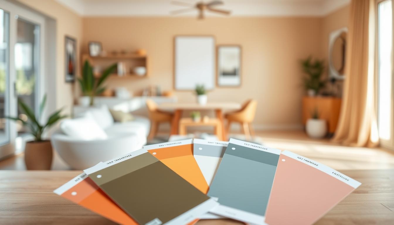
Practical Tips for Testing Colors
Before deciding on a shade, it’s crucial to test the colors in our homes. We can paint small swatches on the walls or use online visualizers. This helps us see how the color looks in different lighting.
By looking at the most popular home interior colors and trending interior paint colors, we can make better choices. These choices can enhance our living spaces.