Did you know that the colors in your living space can change how you feel and work? With so many interior design color schemes out there, picking the right color combinations can feel like a big task.
We’ll help you find the best popular color combinations for home interiors. These should match your style and make your space feel welcoming.
Key Takeaways
- Understanding the impact of color on your mood and productivity.
- Exploring various interior design color schemes to find the perfect fit.
- Learning how to create a harmonious atmosphere with color combinations.
- Discovering popular color combinations for home interiors that suit your style.
- Practical tips for implementing your chosen color combinations.
Understanding the Importance of Color in Home Interiors
Choosing the right colors for our homes is more than taste. It’s about creating a mood that affects our well-being. The colors we pick shape our living space.
How Color Affects Mood
Colors deeply impact our feelings and change a room’s vibe. Warm colors like red, orange, and yellow boost energy. They’re perfect for living rooms and dining areas.
Cool colors such as blue, green, and purple calm us down. They’re great for bedrooms and bathrooms to help us relax.
The Psychology of Color Choices
The psychology of color is complex and personal. Yet, knowing the basics of interior color psychology helps us choose better. Some colors can make rooms look bigger or smaller. Others can affect our hunger or focus.
By thinking about these effects, we can pick colors that improve our spaces.
Choosing Colors for Different Rooms
Different rooms have different uses, and colors should match. When choosing the right colors for your home, think about each room’s purpose. Bedrooms need calming colors like light blue or pale green.
Home offices might do better with colors that stimulate. Coordinating colors for home decor across rooms helps our home feel connected.
Understanding color’s impact on mood and room needs helps us make better choices. The right colors can energize or calm a space, making a big difference.
Popular Color Schemes for Modern Homes
Choosing the right color scheme can make a modern home look great and feel welcoming. The right colors can turn a house into a home where memories are made.
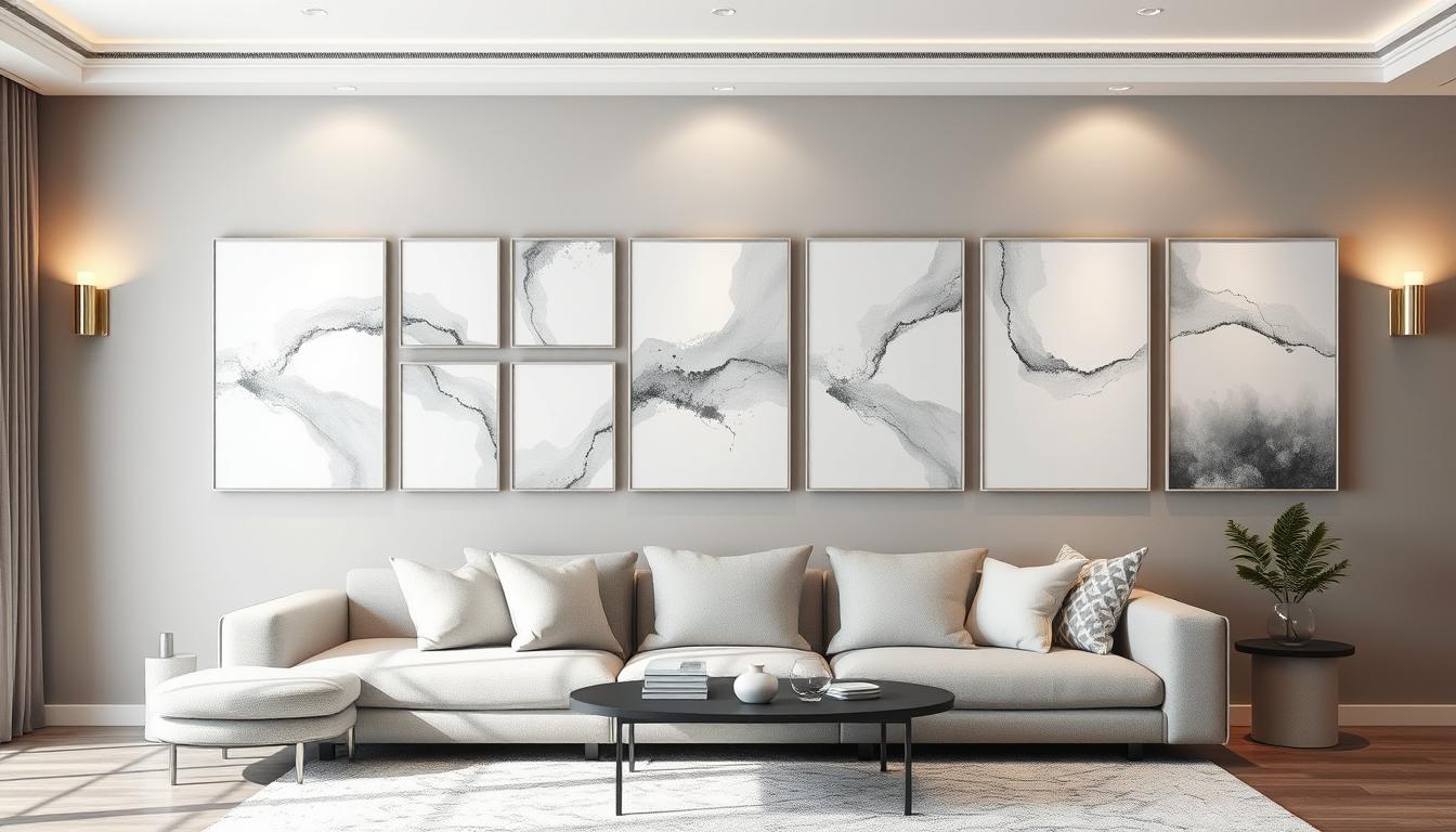
Neutral Palettes: Timeless Elegance
Neutral colors are key in modern home design. They offer timeless elegance and work well with many styles. Shades like white, beige, gray, and taupe create a clean look.
To add interest to a neutral palette, mix different textures. For example, a gray velvet sofa adds luxury, while a jute rug brings warmth.
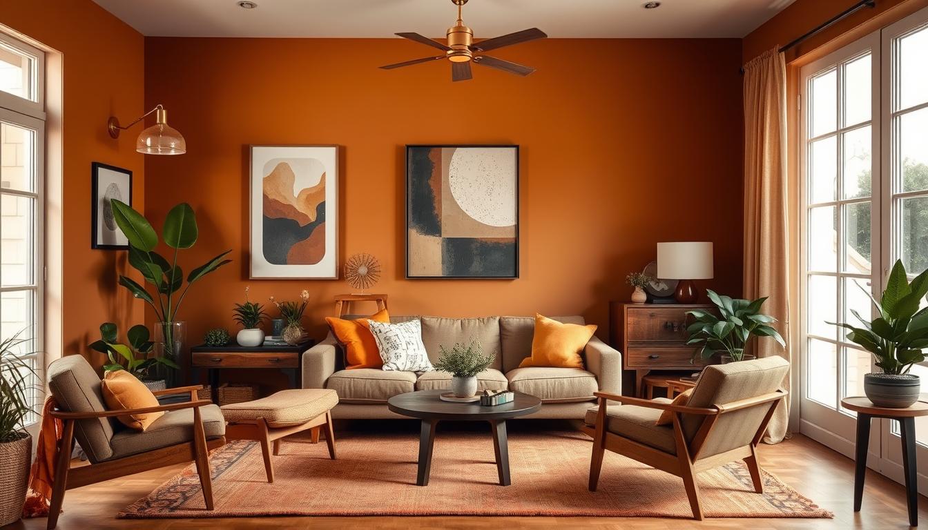
Bold Combinations: Making a Statement
Bold color combinations can really stand out in modern homes. Colors like navy blue, emerald green, and mustard yellow add drama. It’s important to balance these bold colors with neutrals to avoid overwhelming the space.
- Use bold colors on accent walls or through statement furniture pieces.
- Balance bold colors with neutral tones to maintain harmony.
- Consider the 60-30-10 rule: 60% neutral, 30% secondary color, and 10% bold color.
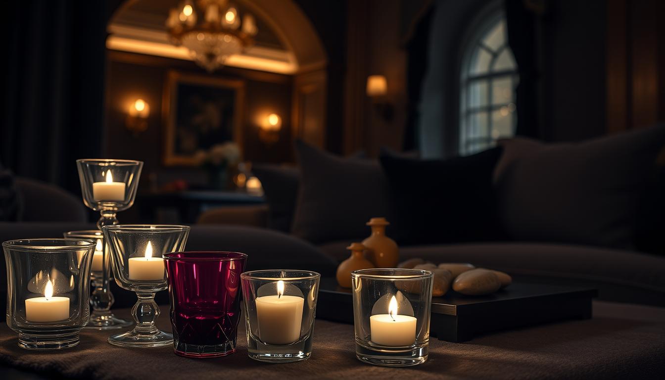
Soft Pastels: Creating a Calm Atmosphere
Soft pastel colors are great for modern homes, creating a calm and serene atmosphere. Shades like soft pink, baby blue, and mint green add elegance. They work well in bedrooms and bathrooms for a peaceful feel.
To make soft pastel colors even better, pair them with natural materials like wood and stone. This mix creates a soothing, organic feel, perfect for relaxing areas.
Selecting the Right Undertones
Undertones have a big impact on your home’s color scheme. They are the hidden colors that affect how we see a color. They are key to the look of your interior space.
Warm vs. Cool Tones
Undertones come in two main types: warm and cool. Warm tones have yellow, orange, or red undertones. They make a space feel cozy and welcoming. Cool tones have blue, green, or purple undertones. They create a calm and serene atmosphere.
Here’s a table to show the difference:
| Tone | Undertones | Atmosphere |
|---|---|---|
| Warm | Yellow, Orange, Red | Cozy, Inviting |
| Cool | Blue, Green, Purple | Calming, Serene |
Testing Undertones in Natural Light
It’s important to test colors in natural light. Natural light changes how undertones look. What looks good in the morning might not in the evening.
To test undertones well:
- Paint samples on different walls to see how they look in various lights.
- Check the colors at different times of the day.
- Think about how the color will match your furniture and decor.
Understanding warm and cool tones and testing in natural light helps you choose the right paint. This way, you can pick colors that fit the latest trends for home interiors.
Essential Tips for Creating Cohesive Color Combinations
To make your home look great, it’s key to know how to mix colors well. A good color scheme can make your home feel welcoming and in harmony. We’ll look at the main tips for mixing colors that look good together.
Establishing a Base Color
First, pick a base color for your design. This color will guide your choice of other colors. Think about the mood you want in your space. For example, blues and greens are calming for bedrooms, while yellows and oranges can brighten kitchens.
Tips for Selecting a Base Color:
- Consider the natural lighting in the room.
- Think about the room’s purpose and the mood you want to create.
- Test the color with different lighting conditions.
Adding Accent Colors
After picking your base color, add accent colors for interest. These colors should match your base color, adding depth and personality. Use the 60-30-10 rule: 60% base color, 30% secondary color, and 10% accent color.
Balancing Saturation and Intensity
It’s important to balance your colors’ saturation and intensity. Too bright colors can be striking but need balance to avoid tired eyes. Think about how your colors work together.
“The right balance of color can make a room feel expansive or cozy, depending on your goals.” – Interior Design Expert
Let’s look at a table to see how to balance colors:
| Color Combination | Saturation Level | Intensity Level | Overall Effect |
|---|---|---|---|
| Soft Peach and Cream | Low | Low | Calming and Soothing |
| Bright Coral and Navy Blue | High | High | Energizing and Vibrant |
| Mint Green and Warm Beige | Medium | Low | Refreshing and Balanced |
By knowing how to choose a base color, add accent colors, and balance them, you can make your home’s colors work well together. Remember, it’s all about experimenting and having fun.
Working with Different Textures and Patterns
To make your space stylish, think about textures and patterns. We often focus on colors in interior design. But textures and patterns can add depth and interest to your home.
Layering textures can make your color scheme more engaging. For example, smooth surfaces like glass or metal can contrast well with rough textures like wood or fabric. This contrast makes your space visually appealing.
Layering Textures to Enhance Color
When layering textures, think about how they work with your colors. Mixing different textures adds depth to your space. It makes it feel welcoming and complex.
Experts say texture is key to a dynamic room. It adds depth and interest. For example, a velvet sofa with a wooden coffee table and a jute rug creates a rich look.
“The key to a great interior design is not just the color palette, but how you layer different textures and patterns to create a cohesive look.”
To achieve this, balance smooth and rough textures. This creates a harmonious atmosphere.
Incorporating Patterns: Stripes and Florals
Patterns like stripes and florals also enhance your interior design. Stripes add energy, while florals bring elegance.
For a stylish look, mix patterns with solid colors. A striped rug with a floral sofa and solid walls can tie the room together. For more ideas, check out our blog: Upgrade Your New Home with Stylish Interior Design.
By using different textures and patterns, we can make our homes unique and inviting. This approach not only improves our color schemes but also adds depth and interest.
Color Combinations for Specific Rooms
Different rooms in our homes have different uses. The colors we choose can change how each space feels and works. It’s key to pick colors that match each room’s needs and character.
Living Room: Inviting and Functional
The living room is where we spend time with loved ones. We suggest warm and inviting color combinations for this space. These colors help us relax and talk more.
- Think about using earth tones like beige, taupe, and sienna.
- A bold piece of furniture or artwork can add a fun touch.

Bedroom: Relaxing Retreats
The bedroom should be calm and peaceful. Soft, muted colors are best for a restful sleep.
- Soft blues and pale greens help us feel calm.
- Adding natural textures like linen and cotton is a good idea.
Kitchen and Dining: Energizing Spaces
Kitchens and dining areas are for sharing meals and talking. Energizing color combinations can make us hungry and chatty.
- Warm colors like orange and red make the space lively.
- Pairing bold colors with neutral ones keeps the space balanced.
Tools and Resources for Color Selection
Choosing the right colors for your home can be tough. But, there are many tools and resources to help. They make picking the perfect interior design color schemes easier.
There are many ways to pick colors. You can use physical swatches or online room planners. Each option has its own benefits.
Utilizing Color Swatches and Samples
Color swatches and samples are great for testing colors. They let you see how colors look in your home’s lighting.
- Get paint samples from stores or manufacturers.
- Put the samples on different walls and check them at different times.
- See how the colors match your furniture and decor.
Online Tools for Virtual Room Planning
Online tools can also help with color selection. Virtual room planners let you see color trends for home interiors in your space.
- Use online room planners or apps with virtual painting tools.
- Upload a room photo or create a digital floor plan.
- Try out different colors and see them in real-time.
Using both physical swatches and online tools helps you make a better choice. You’ll get the look you want for your home.
Common Mistakes to Avoid in Color Selection
Choosing the right colors for your home is more than picking your favorites. It’s about avoiding common mistakes. When picking colors, think about several factors to get a look that works well together.
One big mistake is choosing too many colors. This can make a room feel busy and messy. To fix this, stick to a few main colors. Use different shades of these colors to add depth and interest.
Overly Complicated Schemes
Too many colors can overwhelm a room. For example, using many bold colors at once can be too much. Instead, pick a main color and use others as highlights to keep things balanced.
| Color Scheme | Description | Effect |
|---|---|---|
| Monochromatic | Using different shades of the same color | Creates a cohesive and harmonious look |
| Complementary | Pairing colors opposite each other on the color wheel | Produces a bold and vibrant contrast |
| Analogous | Using colors next to each other on the color wheel | Results in a smooth and natural transition between colors |
Ignoring Lighting Conditions
Lighting greatly affects how colors look in a room. Natural light, artificial light, and the time of day all play a part. To avoid surprises, test your colors under different lights before deciding.

Forgetting About Flow Between Rooms
Think about how colors flow between rooms. Using the same colors throughout can make your home feel connected. For more on choosing the right colors, check out our guide on finding the ultimate color palette for a stunning home.
By avoiding these mistakes and planning your colors carefully, you can make a beautiful home that shows off your style.
Finalizing Your Color Palette
As we near the end of our journey to find the perfect home interior color combinations, finalizing your color palette is a crucial step. This involves ensuring a cohesive look throughout your home. It’s essential for creating harmonious color palettes for rooms.
Cohesive Design
To achieve a unified aesthetic, consider the flow between rooms and how colors interact with each other. Choosing the right colors for your home can be challenging. But with a clear understanding of interior color psychology, you can make informed decisions.
Expert Insights
Consulting with interior designers can provide valuable insights and help you avoid common mistakes. They can offer expert advice on selecting colors. These colors should not only reflect your personal style but also enhance the ambiance of your home.
Adjusting Your Choices
Living with your color choices and making adjustments as needed is a vital part of the process. By doing so, you can ensure that your final color palette is both beautiful and functional. This creates a space that truly feels like home.